
When I look at satellite images of the earth, I see the world without national borders. I see rivers of lights uniting all the countries into a single glowing tapestry. What do you see?
Satellite images if studied in detail could give us much more accurate and less-biased information than any government data provided by local politicians.
Traditionally speaking, empirical work in economics has been heavily based on numerical data, such as Gross Domestic Product (GDP), unemployment, and inflation, etc. In recent years, however, economics is slowly starting to use data from satellites in a more systematic way.
Make no mistake, we can get a lot of information out of these satellite images. For instance, one could use data from satellites to study economic differences across countries as well as to study how poverty levels have changed over a period of time to mention a few.
That said, satellite data itself is not going to give us a better estimate of economic growth than what we already have, however, if the satellite data is used in combination with the traditional GDP data, it could give us a more accurate estimate of current economic growth and a better predictor of future economic growth than GDP alone.
This is the satellite image of North and South Korea at night. The upper left portion is China and the bottom right is South Korea. The pitch dark area between these two countries is North Korea, which appears like a black hole in the sea of light. It not only tells us about the availability and consumption of electricity but also about the standard of living in North Korea.
This image of the Korean Peninsula at night is a graphic visualization of the huge gap in economic development between North and South Korea. We see with even more clarity the isolation of North Korea in direct contrast to the prosperity of the South.
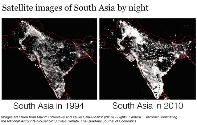
Similarly, these satellite images of South Asia were taken in 1994 and 2010. Do you notice any difference in these two images? South Asia in 2010 appears to be much brighter than it was in 1994, indicating both economic and population growth.
According to the world bank, over the 16-year period, the GDP growth rate of India jumped from 6.659% in 1994 to 10.26% in 2010. The level of light is an indication of the amount of economic activity, and this indicator could be used to estimate changes in economic growth based on changes in luminosity over a period of time.
These satellite images taken at night could tell us as much about economic growth as any official government statistics.
When they say New York city does not sleep, it is partly true—economically speaking. If you look at the satellite image of the United States at night, New York city is brighter than any other cities. Is it a coincidence that New York City is also one of the most economically advanced cities in the world? One could say money lights up the sky at night.
Similarly, in a 20-year period, entire Western Europe is lit up like a Christmas tree. If we look back in time, the area that lights up the most were among the poorest parts of the continent—indicating the improvement in the standard of living.
The change on the intensity of the light also indicates an economic growth over time; bright spot representing areas of high energy consumption, emissions and pollution—factors that greatly contribute to climate change, but that’s a whole different story to tell for another time.